Made in June 2019
This was my exam project on the second semester of Graphic Communication. Horsens Middelalderfestival is one of Europes biggest yearly medieval festivals and are in 2020 celebrating their 25 years anniversary. My brief was to make their anniversary identity with focus on a special logo and a book to mark the celebration. I also looked into other issues and problems the festival might have and came with a solution.
There were three challenges for the festival:
1. They had just gotten a new identity and logo in 2019 so an anniversary logo that is too different could cause confusion and hurt their brand in the long run.
2. How to best showcase the many memories and history of the festival in an anniversary book - and how to make it authentic but modern like their new identity.
3. Their way-finding is not very easy to decode in order to not interfear with the authenticity, so it is hard to find your way around the place.


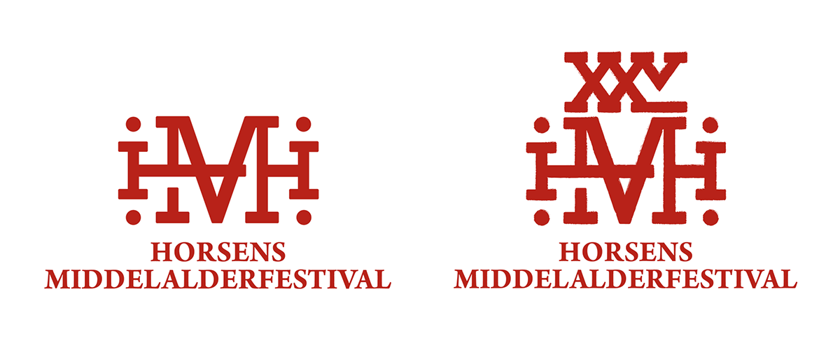
To solve problem 1 i made the choice to keep their existing logo and adjust it. Their logo is on the left. This way it is possible to secure the festivals brand for the future and at the same time mark their anniversary.
The placement of the XXV on top of the logo is made to illustrate a crown and draw lines back to the Danish kingdom in the medieval age, because it was in that timespan that the kingship was introduced.
Because Horsens Middelalderfestival is now one of the biggest in Europe 25 is written in the latin numbers XXV - Latin was the international language back in the day.


Solving the 2 problem. The book takes you through the festivals journey over the 25 years. In the first pages you see a small sparken flame and in the end of the book the whole page is on fire. The illustrations are inspired by the old technique engraving and are emphasising the craftsmanship. The colours have been chosen because it was some of the only colours used back in the medieval times and were made with dirt, flowers and urts.

The anniversary design is build on an old medieval danish saying “Af liden gnist vorder ofte stor ild” which translated means that from a little spark often comes a big fire - the festival started as a small townfest and grew into an european festival.


To solve problem 3 i made the whole festival program into an app, so that all information and a map was always in reach. It is made to sort through the days by time and place, because a lot is happening at the same time in different places. It also gives the guest the opportunity to plan their days at the festival and make their own program.


